Sunday, 12 June 2016

Adventures in time and space, 500 and counting!

Doctor Who Magazine has just published its five hundredth issue with all the magnificence the Guiness World Record-breaking magazine deserves, in not one but two 116-page magazines, a boxed giant party. Current editor Tom Spilsbury asked readers to showcase their collections, which set Twitter alight with comic stacked high in piles, shelves bulging and floors paved with covers. Why not? From October 1979 to June 2016 is a fantastic run, for many people it's not a collection but part of your life, from a childhood love to an adult obsession. DWM welcomed everyone, whether you dipped in and out or proudly own all 500. There is never any fan snobbery, which is how it should be. So I decided to join in too. I counted up my copies and lay out my reasonably size collection of 182 issues, together with 16 Specials, 26 Doctor Who Classic Comics and 8 Doctor Who Poster Magazines, plus one very special Doctor Who Weekly souvenir issue.
A nostalgic way to look back at my life with images of where and when I read the magazine. This got me thinking just how important it was and still is to the comic and magazine industry and its fans. I found myself arguing that the world of comics wouldn't be the same, nor would the magazines we see on supermarket shelves. Now don't laugh but there are unquestionable points to back this up. Let's start at the beginning with the Fantastic First Issue. 11th of October 1979 the start of an adventure of a lifetime. 
Dez Skinn was shaping MarvelUK into a brand that he felt would survive the coming decade with his Marvel Revolution, monthlies where promoted for more mature readers, with The Savage Sword of Conan, Ramage Magazine, Marvel Superheroes and his own Starburst magazine. The weeklies where strengthen with Spider-man getting the cream of superhero action, The Mighty World of Marvel becoming simply Marvel comic, the boys own style action/adventure package, the Hulk got his own weekly with British artists and writers given a platform to show off and Star Wars Weekly left to blossom in glorious sci fi gloss. The Star War Weekly, Hulk Weekly and Starburst productions lead the way for a new fan favourite to be born. A weekly comic with fantastic tales from our TV hero. Now even though I was the perfect age to get this comic, being a comic mad nine year old, but my local distribution was poor. A problem that's marred many a magazine. I wish I had a TARDIS so that I could go back in time and tell my young self to try harder. Whenever I'd get a chance to read those old stories, whether in reprints in specials/Doctor Who Classic Comics or buy back issues I jump at them with adolescent joy. The greatest British creators of the time, if not ever worked on those strips. Not just the lead Doctor Who adventure but the back up strips too. Pat Mill, John Wagner, Dave Gibbon on the Doctors stories and back ups from Paul Neary, David Lloyd, Steve Moore, Steve Dillon and Alan Moore, all worked magic in those weekly Doctorless "missions to the unknown." I know people will say that Skinn was using those creators in House of Hammer/Horror, Hulk comic, Star Wars weekly and Starburst, as and when he could. And that 2000AD and Skinn's own Warrior are better examples of the British comic revolution, but Doctor Who Weekly really pushed those talents into the view of not just comic fans but TV fans too. All that time and space shenanigans, plus articles on the TV series with behind the scenes and passed story reviews and comments. Early signs of a bright future.
In less than a year it went from a weekly to a monthly with September 1980 issue 44. Some may claim that this was a sign of decline, but it was a shrewd move that would save the comic and give birth to the magazine we know and love today. The strips stayed the same wonderfully high standard, with Steve Parkhouse, Alan McKenzie, John Ridgway, Mick McMahan and Mick Austin joining an already stellar cast of creators. The articles got better too. Early signs to a publication growing up with its readership.
Now I wasn't a collector of the mag in those early days, mores the pity, but I would dip in when the chance occurred, I was probably more a superhero comic fan but I've always extremely enjoyed the TV series, so it was alway a pleasure to read the mag when I fancied a change. More so when the TV series left our screens in those wilderness years. 
Many TV production talents worked on the magazine with Gareth Roberts, Paul Cornell, Andrew Cartnel, Gary Russell producing comic strip scripts, TV story board artist Mike Collins always showing fantastic artwork and even the Doctor himself, Colin Baker writing a brilliant script that made its was into a DWM special, The Age of Chaos.
Other great British talent who worked on the strip are worth naming, Alan Abnett, Grant Morrison, Jamie Delamo, Alan Barnes, Simon Furman, John Freeman, Arthur Ransom, Lee Sullivan and Adrian Salmon amongst many more.

 But another reason why the magazine is so important is that it kept going while the parent program was off air. Not just ticking over but loud and proud about how great the show was. It never slagged off the production when it was on TV, so when it rested the magazine took hold up the reins and steered it through the storm. Together with those Virgin novels, the comic strip was the only place to get your fix of the Doctors adventures. It was the video age so I would pay and watch all the tapes I could buy, but the strip was very important to me. In many ways more important than the articles in the magazine, at least to me at the time. My fix of Doctor Whoness. Although those articles told us just how good the show was and soon others would try to show us too.

 The magazines patience payed off when Philip Segal brought the good Doctor back, with a good intentioned TV movie. I really loved it, I really loved how the magazine embraced it. It was a good time to be a DWM reader, cracking articles, great coverage and a brilliant strip. The Paul McGann Doctor strip has always been one of my favourites. If only the TV version had been as much a success. The TV Doctor disappeared once more, but not for long, maybe it wasn't a unsuccessful as many though. A man called Russell had thought it was marvellous too.
 Like the Doctor the Magazine has always Regenerated. New life was given to the fandom with the strong return of the Doctor. Russell T Davies latest reboot exploded onto the TV screen with action, adventure and a lot of heart! The patience of the fans lead by the Magazine had really payed off this time. It wasn't just Cult TV fans or comic strip fans that got the best from this NuWho, but the every day viewer. You didn't have to be a fanatic to be a fan, you just had to enjoy the show. A new love was born, a new fan. What better place to explore this new world, to some at least was the new Magazine, where everybody was welcomed. This glossy, slick publication became the standard that every other sci fi magazine followed. Always fair, always fun, just the right amount of sucking up and the right amount of critic. Always a great read, that's why it's so important to the British comic/magazine industry. And maybe to the world.
It's never rested on its laurels, MarvelUK or Panini spun off some brilliant companions, with seasonal Summer, Autumn and Winter Specials, the spectacular Doctor Who Poster Magazine, Doctor Who Classic Comics with old Doctor tales from pre DWM and their own archives, plus the coffee table gloss of Doctor Who Magazine Special Editions. My summer holidays could never be the same without a thick bound edition to read while I relax.
 Thanks to all those editors Dez Skinn, Paul Neary, Alan McKenzie, Cefi Ridout, Stella Cronna, John Freeman, Gary Russell, Marcus Hearn, Gary Gillatt, Alan Barnes, Clayton Hickman and Tom Spilsbury. Happy 500 Doctor Who Magazine, Splendid mags, every issue. 


"Doctor? Doctor who?"


Sunday, 1 May 2016

What's wrong with superhero movies?

Right cards on the table, I've never been a big DC comics fan. I enjoyed Teen Titans with Marv Wolfman and George PĂ©rez, some Batman, Super Friends, the entire Vertigo line, some other but not many. As a young child I must have watched every Adam West Batman TV episode, which hasn't helped my impression that DC comic are just childish/camp superhero shenanigans. OK I know there as been some cutting edge story telling/artwork from DC, maybe I've missed out but I could never be bothered to trawl though the massive back catalogue to find it when I already had so much invested in the Marvel Universe with its realistic characters dealing with real problems, in my eyes comic that don't dum down. Yes comic are for kids but what kid wants to be treated as a kid? So when Batman vs Superman came out I wasn't excited like a child on Christmas Eve. 
I think by now anyone who really want to see Batman vs Superman must have seen, so whatever I think about it won't matter to them and nor should it. But I think even to those people what I have to say will be of interest. Just like any good film I'm hoping to make you think again, like I did after watching the movie. My history with DC movies hasn't been good, no matter what people say I hate the Christopher Reeve Superman movies, as classic as it maybe the ending of the first has prejudiced my opinion. Spinning the Earth backwards to turn back time suspends my disbelief too far. The Tim Burton Batman movies recovered my faith. Michael Keaton is still my favourite caped crusader, his versions of Bruce Wayne and Batman are perfect in a master class superhero ego and alter ego. Then it all went wrong again when Joel Schumacher took over. Entertaining movies maybe but you can never say classics. Then came a series of inconsistency from DC, V for Vendetta, Batman Begins, The Watchmen all good, Cat woman, Superman returns, Green Lantern, Jonah Hex, not good. Christopher Nolan probably single handedly saved superhero movies with his Dark Knight returns/Dark Knight rises movies. That lulled me into watching Man of Steel, a film of two half's. The first was amazing, a Superman film I really liked, then came the second half, oh dear! I think it's the point were Clark doesn't save his adopted father. Some would say he was following his fathers wishes, keeping his powers secret, it's an important plot point but come on, he's Superman! He could move faster than anyone would see to rescue him and as a plot device why not make him try but fail because he hesitated making his grief worse and his self exile more realistic. The wrong film making choice was taken. 
So then came Batman vs Superman Dawn of Justice, DC's answer to the extremely successful Avengers movies. Could I watch it without any preconceptions? Well I went in without high expectations, I thought Ben Affleck was great casting, but why give him a comedy voice? Zack Snyder has made some great movies but some could he handle the expectations of fans? 
I watch with a mind as opened as I could, but why start with another Batman origin scene? We seen it so many times. Bruce racing through Metropolis was note perfect, showing Ben Affleck off as hero alter ego. I liked Henry Cavill God like Superman, remote from humanity and then Clark Kent, the caring journalist. Jesse Eisenberg's Lex Luther irritated me. Where they trying to make him into a Joker clone? Does every Superman film have to have him in it? Aren't there any other good villains in Superman comics?I really really loved Gal Gadot, her version of Diana Prince was under played but so engaging. There was far too many unnecessary lengthy dream scenes, that took away from the really important, future film plot hinting scene with the flash. What I really can't grasp with it is why Superman doesn't at least try some good PR to get rid of the idea that he's a threat, surely his Clark Kent alter ego would want to do that. Batman would be driven to think that Superman may not be a threat, but why doesn't Superman investigate Batman motives more. It worked a Lex Luther's party when Superman gets distracted from checking out Bruce Wayne, with an emergency rescue. Some people would say you can't over use it, but they're wrong. Of course Clark Kent would constantly be distracted he's Superman for gods sake! In mine mind Lex Luther would create events to distract Superman from finding out his plot. 
So the first half was so so, the second really took off. We got to see what we came for. Action adventure, smart dialogue and a plot that comes together to make sense. I would've liked to have seen more metahumans, maybe some villains and characters from the Suicide Squad in the Luther files who aren't going to be members of the Justice League, but why didn't Bats and Sups get their own files? Flash and Aqua-man video clips were fine but less would have been more in Cyborgs case, making me more hungry to see a character who is less well know when he gets his own film. I did think Aqua-man was going to rescue the Krytonite spear from the deep water but letting Superman do it give him a Herculean task, which he deserved. A bit more Batman and Wonder Woman interaction would have been great too. 
The film could so easily have been better, with the script tightened up, less heavy handedness from the producers and movie company. There's always the feeling that they're try to out Marvel Marvel. The cast where great, the acting was great, the effects where great. There's nothing wrong with making a film for fans.
On the whole I enjoyed the movie, more days after I'd seen it, because the more I thought about it the better parts washed away the poorest scenes. It's not going to completely change my mind on the DC universe but I'm looking forward to the Wonder Woman film, a Justice League film and a Ben Affleck Batman film. So yes it was pretty great on a whole. But I still think that Zack Snyder's original Batman vs Superman movie was a million times better. What film I'm I talking about? The Watchmen of course. Read the graphic novel, watch the film and imagine what Alan Moore would have done with Justice league if DC had let him get his hands on them! 

Final word, DC isn't so bad, I still think Captain America Civil War will be better. 

Make Mine Marvel.

Sunday, 19 April 2015

The truth about Trimpe.

Herb Trimpe sadly passed just only a week ago on the 13th April 2015 in his 75th year. He was born in Peekskill in NewYork on 26th of May 1939. An artist legend best remembered for an incredible run on Marvel's Hulk. Perhaps not celebrated in the same way as his artist peers. 
Telling the truth about Trimpe, I haven't always favoured his style of artwork. Which I think comes from my British point of view among other things. So I'll look mainly at his British published work to get to know why that is. You say to any MarvelUK fan the name of Herb Trimpe the reply is The Mighty World of Marvel. Trimpe's Hulk run, which is incredibly long, comes right at heart of MWOM strongest period, where the Hulk was the titles headline week in week out. The second thought would be he was the artist involved in the creation of Britains own Super hero, Captain Britain. Trimpe also became known for another green giant who appeared in Marvel Comic, Dez Skinn' action/adventure comic that came from his Marvel Revolution transformation of MWOM, as Godzilla came to the Marvel universe.
    Although Trimpe did have his British fans not all Brits sang his praises. MWOM letter pages where filled with reader comments about how he'd lost his pencil sharpener, with his line work getting thicker and thicker the more artwork he drew. Although it mainly was meant as a joke, I couldn't help but agree with it. A blunt pencil may have been the cause, or possibly the choice of inker may be to blame, who can say. Many readers preferred "hipper" artists like Jim Steranko, Neal Adams, Jim Starlin, Paul Gulacy Frank Brunner & a young John Byrne. Artists like Kirby, Dikto and Trimpe were seen to much as the past generation. I have to add as a kid I always loved Spider-man over the Hulk. Cause I was skinny as a child I felt I more incommon with the teenage Peter Parker than the power house Hulk or his scientist alter ego Banner. So when I read those stories back in the 70's all I saw was a precession of meaningless monster battles and meaningless dialogue, "Hulk Smash!" But was that Herb's fault? The writers of that time, Roy Thomas and Len Wein are some of my favourite writers. But Marvel give comic readers what they wanted, big battles. These days I see a lot more than that. Trimpe's work had detail and emotion. 
  
Could you ever imagine the Hulk fishing, or sitting around a camp fire with a friend like CrackaJack Johnson like this in a modern Hulk Comic?
Trimpe was a strange choice for Britains first flagship hero. Chris Claremont handled the writting mainly 'cause he had lived in the UK and also he was free to write it. Trimpe was also free to produce the artwork needed to fill Captain Britains weekly demands. So he was handed the job after a publicity trip to the UK with Stan Lee in 1976. 
Trimpe was also criticised over his portrayal of English life with strange looking police bobbies and unusual architecture. But to be fair London isn't New York, I can imagine many American artist would be able to capture the English look, with the exception of Byrne. Although I must admit I love his version of British Airways Concorde. Trimpe English characters in many ways could have been French, German or Italian. I still have a soft spot for these stories and Trimpe's CB work. 
It should be noted that not only did Herb create the look for Captain Britain, but also he also brought us Elizabeth Braddock (the Captains sister who would become Psylock), Courtney Ross and Chief Inspector Dai Thomas among others characters. One of the criticism of Chris and Herbs run was that Brian Braddocks life mirrored Peter Parker, with Courtney the love interest, Dai Thomas as a hero hater similar to Jonah Jameson and even a early Flash Thomson style bully in the form of Jacko Tanner. Agents of SHIELD fans should note that Claremont/Trimpe also created a British STRIKE (the British version of SHIELD) agent called Lance Hunter. Although their version had a Bobby Charlton comb over, looking nothing like Nick Blood's version. 
Another another character said to have been created by Trimpe was Wolverine. This is a bit of an urban myth. John Romita Sr created the concept artwork for Wolverine, while Len Wein, the Hulk scripter formed the character. Trimpe recalls in a 2009 interview how he "distinctly remembers" Romita's sketch, and that, "The way I see it, Romita and writer Len Wein sewed the monster together and I shocked it to life!" But that's what Trimpe did best, he give life to the stories we wanted. His work was always filled action, adventure and a big helping of humanity even with the biggest of monsters. 
These days my opinion of the Hulk has changed, mainly because my opinion  of Herb Trimpe has changed. I read these stories with nostalgia and without my childish habit of trying to be cooler than I was by acting older. Smashing tales from happy days, "Hulk Smash!"

Herb Trimpe, rest in peace.

Make Mine Marvel.


Sunday, 5 April 2015

British Spider-can!

These days Spider-Man changes his costume design all the time, but back in 1984 Peter Parker only wore one set of long johns. At least to British eyes. In America Spidey had took a trip to the stars with the Marvel Heroes, to the Beyonder planet in Marvel Superheroes, Secret Wars and came back with a black and white outfit. At first American fans hated it, but soon grew to love it. It was thought that British fans would also share their cousins dislike of it. We're not supposed to like change! I loved Spider-Man British weeky that had been running since 1972, but as a reader of the U.S. additions I knew what was coming and had no fear that the changes wouldn't spoil this love. MarvelUK wasn't to sure that the rest of the UK could handle it, so it was decided to carry on with the red and blue version of the web slingers adventures but written and drawn by Brits for a British readership. 

So on the 27th of October 1984 in issue 607 MarvelUK published Britished made Spider-Man adventures. This wasn't the first time MarvelUK had used American charactors as leads for strips, back in 1979 Dez Skinn created The Hulk Comic with Nick Fury, the Black Knight and the emerald giant starring in British created strips. Captain Britain, who had started in a MarvelUK comic, originally written and drawn by American creators, was also in a lengthy critically acclaimed British produced run, at that time Mighty World of Marvel monthly. To publicise Spidey's first British foray the plot used the creative idea that Spider-Man was asked to appear on ITV's Saturday morning kids TV show, Saturday Starship. A costumed Spider-Man look-a-like also appeared for real on the show that same day as the published comic. 
Mike Collins who's early work had appeared in a Marvel Showcase in MWOM monthly not to long ago was handed script duties. Barry Kitson handled the artwork, his first professional work. Mark Farmer finished it off with inks. Collins would go on to work successfully for publishers on both sides of the Atlantic as well as a story boarder for BBCs Doctor Who and sometimes artist on Doctor Who Magazine. Kitson went on to draw Transformers for MarvelUK which lead on to success for US and UK companies. Farmer became an inker well known for inking Alan Davis artwork. 
Collins took over the artwork from Kitson in issue 608 for part two. Possibly to keep up to the weekly deadline. This didn't damage the story in anyway, in fact his artwork looked very similar, possibly their style was intended to be the in house Spider--Man style. This style worked really well and was a very enjoyable read.
Kitson returned to pencil the third issue 609. In keeping with the UK Spider-Man style, which was helped by Mark Farmers classic inking.

For the final British instalment Collin scripted and penciled again. On the whole it was a successful experiment, but one that sadly wouldn't be continued. The product was great but it was seen impossible to maintain new continuity with the original US version and produce a strip weekly. Ironically MarvelUK would choose not to use American or British continuity to solve the question of black and white or red and blue. Instead when the time came they turned the comic into an infant rag comic much like Ultimate Spider-Man produced by Panini, a three weekly comic aimed at very young children. which ignores all and any continuity. This move did nothing but leaving many loyal readers to abandon the weekly for the original American imports. 
The 1984 tale finishes off with some modern pop culture references and then dovetails into the next issue, an American produced story written by the legend that is Stan Lee. The web slinger still wearing his original red and blue togs, but the black costume was on the way whether MarvelUK liked it or not. Sadly not soon enough. But that's a tale for another day. 

Make Mine Marvel.


Saturday, 10 January 2015

Cover story.

Now Christmas is long gone and the decorations have been boxed up for another year it's time to look at a modern tradition I've started these last three years. As long as I've been on twitter I've enjoyed sharing classic covers that set my fan senses tingling. So much so that for the previous two years I've posted a gallery of classic covers with a seasonal slant as an advent calendar, pictures of British annuals, winter specials or any magazine that was published around that time of year with any Christmasy trappings. Father Christmas, a Christmas tree or even snow. For my third year I tried something different. I picked twelve original American covers and compaired them to their British cousins, making up the 24 days of advent.


I started off with an absolute classic from the "King" himself, Jack Kirby's cover from The Fantastic Four #45. It pictures the Fab Foursome searching for the mysterious Inhumans in Stan Lee and Kirby's fabulous "Among us hide the Inhumans!" The bright cover of the original must have caught the eye of many a young comic fan as it sat on comic racks, but to me it was too brightly lit. The moon although full is behind all the characters, the FF should be in shadows as they search the dismal ruins. The lnhumans look lit from in front, but the moon is behind them too. MarvelUKs somber, moody version from Fantastic Four Pocket Book #2 suits the scene perfectly, as I imagine Jack originally intended. 


This is one of the most creative uses of a character interacting with a comic book title and a story title as Jim Steranko's straining Hulk is crushed between the two, with the green goliath raging, veins bulging and sweat pouring from his stressed body and face. The editor or the powers that be suggested that Steranko's savage version of the Hulk was "too fierce" for the cover of Hulk King Size Special #1, so Marie Serverin, the Hulks regular artist at the time was asked to re-draw the Hulks face, to which Steranko as now referred to as "the teddy bear Hulk." Strangely enough the savage version did see the light of day over six years later, with face intact on MarvelUKs The Mighty World of Marvel #129, the only difference being Steranko's lettering, the Hulks foot crushing the word "Inheritor" instead of the "Inhumans", as this comic featured a different story "The Inheritor" originally from the Incredible Hulk #149. 


Days five and six advent covers come from John Romita JR and Bob Layton as they modestly show you how the crimson and golden Avenger gets dressed. I like the use of light shining off the armour, plus the simple panel layout to tell a story. There's not much difference between the two versions but in the UK Iron Man never starred in his own comic, but made it loads of time as back up feature in many comics, this time he backs up Captain America as any good Avenger would. 


This cover shows how subtle changes can improve on an already perfect John Buscema cover. The main difference from the American Avengers #58 and the British #84 was the Visions ghostly presents. Yes in many ways the white Vision is the correct colour choice, but in the classic story- "Even an android can cry!" the tale features the Vision. He's the linchpin of the story so in my mind the blue version highlights this, his appearance behind the Avengers could be seen as a menace or teammate. In this part of his history we've yet to find out full which. Notice how the Visions collar/cloak are more defined in the second cover, I can't give any reason for this. 


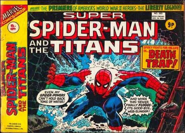
John Romita SRs dramatic cover for the Amazing Spider-Man #151 shows our hero holding back a torrent of water in a confined drain sewer. In the original he shouts "Flooding this sewer won't help you mister!" to an unseen hostile, which would probably be the Shocker. MarvelUK cranks up the suspense and tension by laying the cover on a landscape format crushing down the web slinger in Super Spider-Man and the Titans #203. The danger is most certainly from the waves of water, pitting Spidey against the most cruelest of elements in a claustrophobic image. Truly amazing! 


Wolverine takes centre stage on the cover for the Uncanny X-Men #133. John Byrne's style is near perfect for action intense covers. But again MarvelUK make one slight change that increases the action packed frenzy as Wolverine lashing out. The black box frame cuts out some of Byrne's detailed back ground, boxes in a warehouse. In Rampage Magazine #51 the fighting mad mutant slashes Hellfire Club goons out of the page. It's almost a 3D cover now! 


John Byrne is the artist for my next classic cover. As always Byrne is pencil perfect with this foreboding image of Dragon Man chewing on the star spangled Avengers shield like a dog with a bone. Johns colours are moody for Captain America #248, while British comics generally are darker in presentation MarvelUK ops for a brighter colour palette with #2 of their take on the Captain's comic. Not a bad decision when British racks are filled with grim and broody war and sci fi comics at the time. 


John Buscema this time renders splendid work for this clash of God verses Cosmic Hero! The colour from Silver Surfer #4 and the Super-Heroes #8 changes slightly, but doesn't effect the scene, however what I find interesting is the Surfer seems to be the antagonist while Thor stands ready to defend himself. In the second version Thor's hammer whirling movement signal equal battle frenzy as the titans prepare to clash. Was it removed from the original or added in the later? 


Wolverine and the Hulk clash this time in what has become the ultimate hero battle. This Herb Trimpe classic cover has been re-draw many times by different artists. If you look on-line for it there are different versions of the original. All basicly the same, some have more of a red background, some have the Hulks face turned slightly. I think this is the correct version of The Incredible Hulk #181 that I've shown. I imagine the confusion comes from the millions of copies that cover t-shirts, mugs, bags and other merchandise which use this cover. Some even use the Mighty World of Marvel #198 version with the Hulks face in full view and the subtle changes of position for Wendigo and Wolverine. John Romita SR is said to have made changes to the original cover, this may be why these variants appear. I dare say the the Canadian Rockies will have seem a red sky at sunset but was it for artist reasons. White skies have a more real feel. 


MarvelUK knows how to re-use a classic, in this case they take Jack Kirby's soaring Surfer cover from the Fantastic Four #72 and re-use it for a different story, this time the Silver Surfer's first solo story in The Super-Heroes #1. Minus the onlooking Watcher. The enigmatic red background is also changed for an ecliptic colour scheme.  if I'm honest it makes no difference to which one I prefer, they're both equally cosmic!


We reach days twenty one and twenty two of my advent calendar, this pop culture/Salvardor Deli inspired Captain America cover from #111 by Jim Steranko ticks all boxes. As the centre issue of a sensational three issue run by the artistic genius it's no wonder it was chosen as the cover of the 1980 MarvelUK/Grandreams hard backed annual. If truth be told I saw the annual first and spent many hours reading and re-reading this classic tale which included the Hulk, Rick Jones, Hydra, Madame Hydra, Nick Fury and the Avengers, so it's no wonder that I adore this yellow framed version with it nostalgic memories. 


My Christmas advent calendar is completed with another tension filled John Romita SR cover of Spider-Man and torrents of water. This time our hero is unconscious and shackled as the water level raises, from the Amazing Spider-Man #52. Jameson looks on in stark horror as he too is minutes away from death in the Kingpin's sub basement. It a desperate and dark scene to finish off with you may think, but MarvelUK, possibly with tongue in cheek added "A happy Christmas to all Marvelites" across the top of Spider-Man Comics Weekly #46, an issue that was published the Christmas week in 1973. A fitting sentiment to post on Christmas Eve. 

Make Mine Marvel.