Week Ending 4th May 1974

Without any warning all three mags this week sneakily feature a price increase of a penny to seven pence. In October 1972 you could by one issue of the Mighty World of Marvel for five pence, by February of the next year MWOM and the new Spider-man Comics Weekly would both still cost five pence each, meaning that your weekly fix of Marvel set you back the sum of ten pence a week. With the introduction of the glossy covered Avengers weekly at the price of six pence your pocket money had to stretch to sixteen pence a week. Soon (January 1974) both MWOM and SMCW gained glossy covers, and extra pages, so the price matched the Avengers setting British Marvel fans back eighteen pence a week. Four months later and the individual price for a weekly comic rose again by a penny to seven pence, which would be the equivalent in purchasing power to about 91 pence today. In 1974 the inflation rate was 16.04%, the cost of everything was going up, even comics and we think in 2024 we've got it bad with the current rate of 3.9%. The current UK version of the Amazing Spider-man, published by Panini, costs you £3.25 per issue, yeah it is monthly, in full colour and contains 48 pages, about two American stories. A single US imported comic would set you back at around £4.40 per issue. So I imagine that seven pence might feel cheep. But to a kid in 1974 who needed twenty-one pence a week, you might have to give up those sweets, which wouldn't be a bad thing for your teeth. So dentists would advise you read comics, don't eat sweets kids.
The Mighty World of Marvel #83
This cover looks like one of those Charles Atlas get muscular quick adverts. Did someone kick sand in the Hulk's face? The crowded beach doesn't quite match up with the couple having a picnic at the beach scene that's portrayed in the story. I know the Hulk sells the comic but it would have been a nice change if the Fantastic Four featured on the cover once. Anyway artwork by Larry Lieber (pencils) and Mike Esposito (inks), or possibly John Tartaglione (inks) if I was to believe the Grand Comics Database, which I always do.
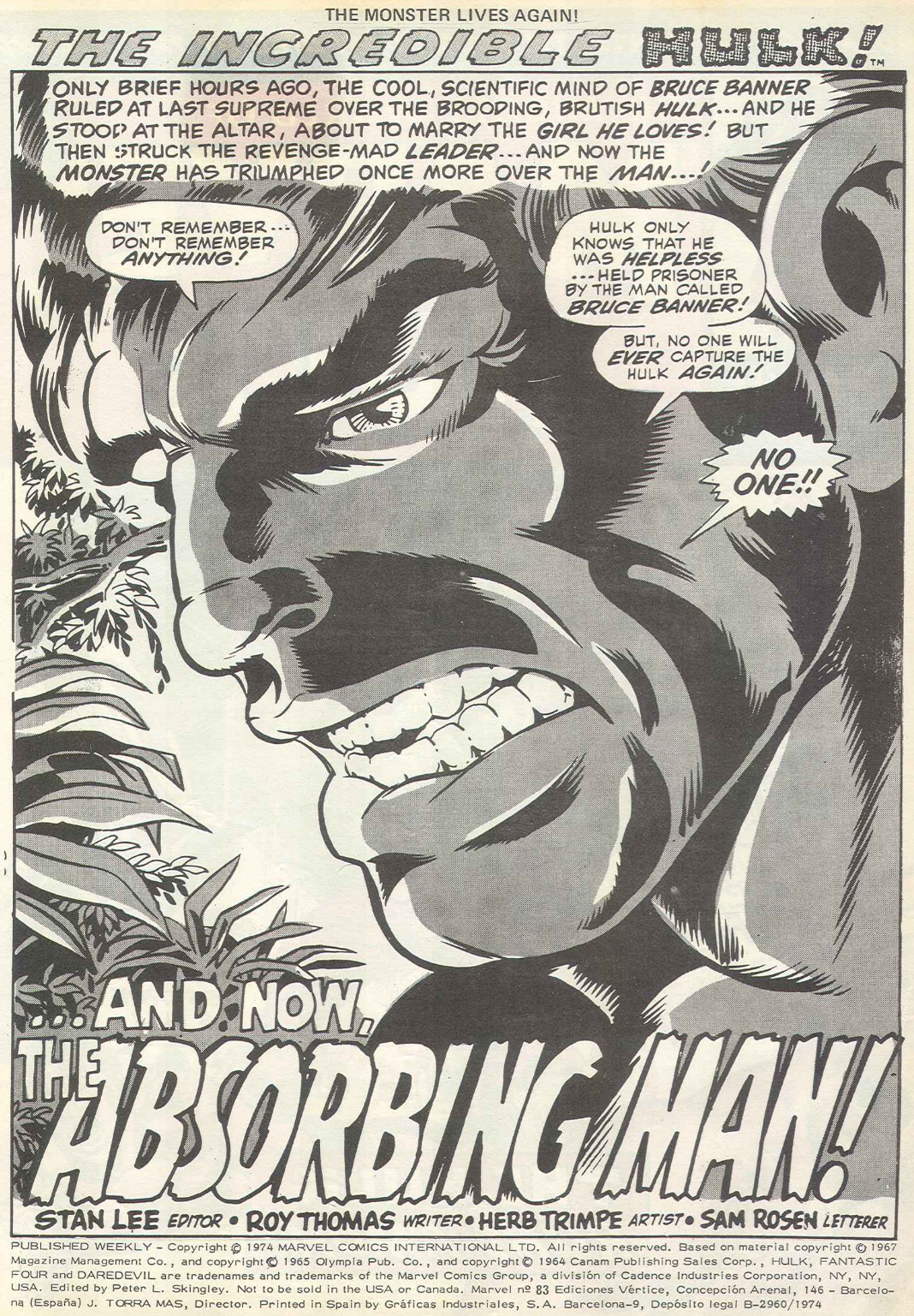
The Incredible Hulk “...and now, the Absorbing Man!”
Writer: Roy Thomas
Artist: Herb Trimpe
Inker: Herb Trimpe
Originally published in The Incredible Hulk #125
Cover date March 1970
(Published in December 1969)
Now that Trimpe has caught up with his schedule, with the help of Sal Buscema's inks last issue happy Herb can get back to inking his own artwork. It is sometimes called the blunt pencil period, but to be truthful his lines do get a lot thicker in later stories when we can all call for a pencil sharpener. We're entering a classic period of Roy Thomas/Herb Trimpe of smashing Hulk stories, were every story features the green skinned rage monster against some other equally powerful creature or super human. The title might give away who's it going to be this week.
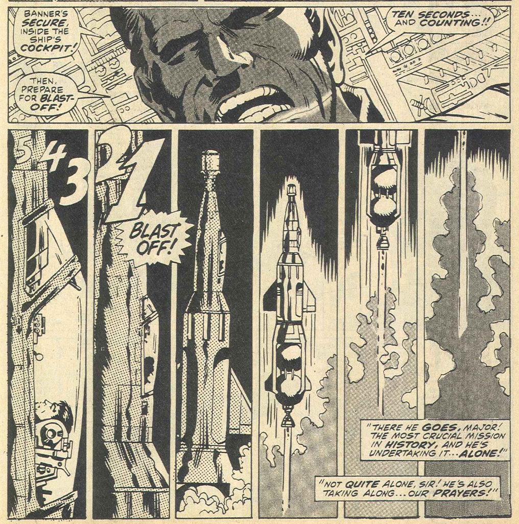
But before we can get to that the Hulk wrecks a young guys car, then takes a nap to transform back into Banner who overhears on the radio news about the world's impending doom. A radioactive comet is on collision course with the Earth. It's a proper 60's/70's end of the world movie plot line and the only man who can figure out how to avert disaster is Bruce Banner.
With General Ross recovering in hospital with Betty nursing him back to health, Major Talbot has to take orders from a General Morris who asks him about the identity of a ragged stranger who offers his aid. Talbot vouches for Banner who explains his plan without any concern for the health or well-being of Betty or the General, which involves him piloting the new X-890 rocket with a nuclear warhead into the heart of the comet. Well he hasn't got time for pleasantries, it's hours away from the end of the world so Banner gets on with the task.
I might have made a blunt dig at the sharpness of Herb Trimp's pencil earlier, but the man can draw and his ability to tell a story with the use of interesting panel shapes and layouts shouldn't be under-estimated. Look at the six tall vertical panels that pulls the viewer away from Banner and the rocket as it takes off. Or the five near black panels showing the rocket getting smaller the closer it gets to the comet, simply giving the impression of distance and drama without any dialogue or text in the cold silence of space.
As Banner releases the nuclear payload, seconds before it is detonated a cosmic hitchhiker hops a ride. We soon find out who that mysterious unwanted passenger is as Trimpe gives us the impressive image of Crusher Creel, the Absorbing Man. British readers would have remembered Creel from his last appearance in the Thor adventure from
SMCW #51 where he was sent off into deep space with Loki the God of mischief by Odin after the pair had tried to take over the kingdom of Asgard. Which completely connects with his comet-ride antics. Another thing that Trimpe is really good at is drawing super-beings for the Hulk to battle. So with this teaser we know we're going to be in for a "Death Match" battle next week.
Marvel Bullpen Bulletins
All the Bullpen Bulletins this week start with an all you need to know item about the comic drawing life of John Romita Sr from the man himself. From his days at the New York High School of Industrial Art, now known as the New York School of Art and Design, to his time joining Stan Lee at the pre-Marvel Atlas Comics. Then his two years of national service, drawing recruitment posters for the army. His drifting over to the distinguished competition in 1957 before returning to the fold in 1965 to produce the great stuff we all enjoy when we read these mags. Stan's Soapbox is used to discreetly ask letter writers to make their correspondence short but sweet as the Mail bags are getting heavier and more mail means less time to read it all for the weary bloodshot eyed Bullpen. The next item mentions an amateur film made by a bunch of New York filmmakers about Herb Trimpe. I can't be totally sure but I think this is the one-
Herb Trimpe We love you! Next week's Bullpen Bulletins promises a feature on celebrity Marvel fans. Special to MWOM is an item on the cross over of super-villains to different heroes that they normally wouldn't as way of explaining Thor's nemesis the Absorbing Man, becoming the guess antagonist in this week's Hulk strip. We've also got a usual checklist of British Marvel's other two mags. No Daredevil this week, so it's straight onto the Fantastic Four.
The Fantastic Four “Defeat of the Frightful Four!”
Writer: Stan Lee
Artist: Jack Kirby
Inker: Chic Stone
Originally published in The Fantastic Four #38
Cover date May 1965
(Published in February 1965)
The Fantastic Four are entering a period of creative extravagance and indulgence from Jack Kirby that pushes creditability to glorious levels and is only held in check by Chic Stone's inks, or soon repressed by Vince Colletta. Don't worry Kirby fans, Joe Sinnott will soon embellish the King's artwork, giving it the freedom it deserves. This opening splash page is not an actual futuristic city, but an enlarged picture taken of the Skrull's Home-world by an automatic camera fitted to the FF's space craft as they left the Skrull galaxy last issue. Johnny, Ben and Reed are actually standing on the photo. It's a wonderful idea that I've never seen before or since. There's no doubt that Kirby was a creative genius.
The Fantastic Four and Jack Kirby aren't the only ones having fun, this story sees the return of the FF's arch enemies the Frightful Four, who are quickly re-introduced with a bit of horse play. They're still the same original four members but now Paste-Pot-Pete has decided that his old name was completely lame and has adjusted his costume and weapons to fit in more with his new moniker, the Trapster. He thinks it's a name with dignity and drama but in fact it's only just an improvement on Paste-Pot-Pete. As you can imagine the Frightful Four seek revenge on our four heroes, so they start first by kidnapping Sue Storm by having Medusa pose as a new clothes designer. I do think that Medusa should have posed as a hairdresser because one, Kirby has given Sue the worst hair-style in comics this issue and two, Medusa as a hair-stylist fits perfectly in a fun way.

One page is removed from the original strip before Reed finds out about Sue's abduction. It isn't something that most readers would have missed, it only contains a scene where a newspaper salesman is trying to sell the Daily Chronicle with the news headline about her abduction and the Thing flying past in the Fantastic-car to pick up a copy to read. The Fantastic Four go off to rescue her with the Human Torch the first to become trapped in another one of the Trapster's devises. Ben and Reed follow him to a remote island in the Pogo-plane only for it to get cut in two with the Trapster's Buzz-saw gun.
Sue frees herself as the battle ensues. Her calls alert her three team-mates as the evil foursome use the opportunity to escape. Ben discovers a "Q" Bomb left on the remote island as part of the Frightful Four's final fatal trap. With the Pogo-plane totally demolished the group are unable to escape the blast and it's only the quick thinking of the Invisible Girl and her invisible force-field that saves them. Unconscious the quartet survive in a force-field that bobs on the surface of the sea, created by the will of one girl. But already we can see that the blast from the "Q" bomb has had consequences as the heroic quartet lie silent and still, as a startling transformation occurs to Ben Grimm as he reverts to his human form. Really, don't miss next week's continuation!
The Mighty Marvel Mailbag
Dave Emery (no relation to Dick. Well that's one for the oldies.) from Hampshire, makes some observations, the first is that Namor, the Sub-Mariner could be Italian due to the fact Namor is Roman spelt backwards. He also points out that the Leader in
MWOM #16 has a short fat head and in
MWOM #68 he has a long thin head. Different artists different heads. Keith Graham from Middlesex doesn't want colour inside the British mags, much preferring British Marvel to spend time developing new mags. Andrew Whiley from Kings Lynn bought the Marvel Letter-pack and thinks it's terrific. Gary Desborough from Surrey thinks it's great to have three features in MWOM each week, but finds some covers on recent MWOMs don't always relate to the stories inside the comic.

Leuk Lacovides from London, or should that have been Luke LaCovides? Either way, thinks that 1974 will be a great year, what with MWOM and SMCW both getting glossy covers like the Avengers and the return of Daredevil. He adds that the improvements should win Marvel more "customers". David Bennett RFO, KOF, from London has been reading Marvel since it first came out and wants to put forward some new ideas. 1) bring back the Green Goblin, 2) Take Thor out of SMCW, 3) Have more Namor and 4) More origin stories. Brendan Murphy from Manchester who is another Marvel fan who wants Super-hero models. He, like Keith Graham, is fine without colour inside the mags as long as the artwork is readable. Alan Wiley from Camberley has really been thinking about how Marvel characters internal organs and clothes are effected by their powers, adding if Mister Fantastic stretched after he had eaten would it take ages for food to reach his stomach? Why doesn't the Human Torch's clothes burn and when the Absorbing Man changes to steel or wood does the inside of his body also change to steel or wood? Well like swimming it's good not to stretch after eating, the unstable-molecules in the Torch's clothes stop them from burning and I suppose that the Absorbing Man does have a wooden heart or a wooden brain.

The inside back page is used to advertise Mighty World of Marvel's brother comics instead of the colour back page and we'll see why very soon. The cover from the Avengers weekly gets rolled out while Spider-man Comics Weekly has to settle for an action packed panel from this week's Spider-man strip. Did the editors not have the confidence in those covers? I suppose that seeing Spider-man in action is enough to sell the comic alone. That panel is by John Romita Sr and it's the first panel of page five of this week's SMCW. The action on the Avengers cover looks great and would intrigue many readers to buy it.
As for the back page of this week's MWOM, after judges spent three exhausting days working through 9000 entries to pick the ultimate winner of the Marvel Artist competition, who walks away with the first prize of a colour TV is proudly announced on the colour back page.

BLITZKRIEG by Andrew Updraft from Cleethropes is chosen by Stan Lee who says it's "a great idea." while fellow judge Frank Dickens adds he's "a fabulous character with great powers." BLITZKRIEG can turn himself into one of ten creatures just by touching one of the letters on his belt that make up his name. So it's either a Bear, Lion, Impala, Tiger, Zebra, Kangaroo, Rhino, Ibex, Elephant or a Gorilla. An impala and an ibex may not be well known to young British readers as an African antelope or an Asian mountain goat but if anything that's educational. I have to be honest I didn't like this as a winner. The animal shape-shifting using the letters from his name was a clever idea. But there must have been a multiverse version where the creatures that made up BLITZRIEG where all different lame animals instead like Bluebottle, Lemming, Inchworm, Toucan, Zonkey, (that's a zebra crossed with a donkey,) Rabbit, Irish setter, Escolar, Gerbil. With those super powers he's not going to be great at stopping crime or taking over the world. OK I'll stop now. He does look like a villain too, which to be fair the competition was for either a hero or villain. There's a lot of Nazi imagery going on, I'm not sure that Andrew picked the swastika medallion to make him a Nazi villain or did he like the look? I feel the over all look bears a slight resemblance to DC's Doctor Fate, with the helmet and colour scheme. In truth I'm being a little too prickly, it's a creative idea and not a bad design. Thank goodness I no longer have my original design for the Beesting that I drew when I was about ten or eleven, then everyone can critique my Spider-man/Yellow Jacket rip-off. As well as a colour TV Andrew was also awarded the title of TTB (Titanic True Believer) by Stan Lee who also said that "You young readers produced some of the most imaginative ideas I have seen!" As Andrew won the top prize someone else now has the chance to win Andrew's age group prize of a radio. So next week forty-five consolation prize winners will be printed in all three mags, that's fifteen in each weekly.
Also teased at the bottom of this feature is news of a "Super Summer" as the editors are sailing through sacks full of boat contest entries. There's also a promise of another Gladding rod and reels competition in June for those Marvelytes who enjoy fishing. While in July it will be another art contest called Meccano-Mania with lots of prizes to be won.
Spider-man Comics Weekly #64
Ron Wilson (pencils) and Mike Esposito (inks) drew this original cover for Spider-man Comics Weekly, with some pencil adjustments by John Romita Sr so the Grand Comics Database leads me to believe. Like this weeks MWOM cover the scene isn't completely accurate to the lead story inside. The original Vulture had already beaten Blackie Drago's new version last week. The headline "Double Bonus! The mighty Thor and Iron Man!" doesn't read true either as both heroes appear regularly inside every week, so where's the bonus?
Spider-man “The Vulture's prey”
Writer: Stan Lee
Artist: John Romita Sr and Don Heck
Inker: Mike Esposito
Originally published in the Amazing Spider-man #64
Cover date September 1968
(Published in May 1968)
This is another great looking splash page from John Romita Sr. I love the menacing shadow that falls onto the chimney breast. It's a great way to show the on-coming attack that's dramatic without it looking too static. I've always said that Romita's opening splash pages tell so much of the story in one image. I'd love that original artwork up on my wall.
There's no stopping the action this week as Spider-man has to go headlong into a sky battle with the original Vulture. Romita is the perfect artist for Spider-man, he can do Peter's civilian life after working for many years on romance comics for Atlas and DC and he's also the master of action comics which he perfected during his time at Marvel. It always looks big and bold, using mainly two or three panels per page Romita allows the action to flow as hero and villain exchange blows. Romita doesn't forget Peter's cast of characters either, they're there not to just watch the unfolding duel, no their over-eagerness to grab the story leaves Jameson and Robertson in harms way as some falling masonry hits Robertson as editor pushes editor-in-chief away from the falling debris. The fight isn't over will this give the Vulture the advantage to beat his prey? Find out next week.
Marvel Bullpen Bulletins
The bullpen Bulletins in Spider-man Comics weekly this week has pretty much the same items as the one from the Mighty World of Marvel, with the exception of a Marvel checklist that features this week's MWOM and SMCW listings and a special item directed to Thor fans who often ask the question of why does Asgard look different from tale to tale? Well the answer is that Jack Kirby usually forgets how he last drew the fabled city so he has to re-create it again. An honest answer but may be he should keep some of his old art for reference.
Iron Man “Iron Man battles the Melter!”
Writer: Stan Lee and Robert Bernstein
Artist: Steve Ditko
Inker: Don Heck
Originally published in Tales of Suspense #47
Cover date November 1963
(Published in August 1963)
This adventure is the introduction of the soon to be classic Iron Man villain the Melter. I always big up Don Heck by saying what a creative influence he was to early Marvel super-hero comics. Well he was. The number of characters he created for Stan is immense. He was great at romance comics which fits in with Tony Stark's personal life and he came up with lots of ideas for costumes and weapons. Sadly not all those costumes were great. Although some of that design faults must go to Iron Man's latest artist Steve Ditko.

The Melter is a smart idea for a villain to fight Iron Man, with his chest mounted "Melting Ray" that instantly melts most forms of metal without the need for heat, so that anything near the metal object is unharmed. Basically the science behind it is a magnetic induction field generator is used to project an energy beam at the specific frequency required to loosen the binding forces between metal atoms, causing metallic objects to liquify. What isn't smart is Ditko's original suit design. He looks like an ape in a cape with trousers and shoes that he got from a DC comics jumble sale. In saying all that the story was good, in a nut shell Bruno Horgan loses military contracts after Tony Stark points out that Horgan has been using sub-standard materials in the construction of tanks for the army. When by accident Horgan discovers that one of his inventions can cause iron to melt he fashions a costume around that devise and sabotages one of Starks plants in the name of revenge. The action follows, can Stark design a method to defeat the Melter's metal liquefying ray? Find out next issue.
Now my hard copy had a wonderful Spider-man centre spread, which we'll look at in a bit, but the digital version of this week Spider-man Comics weekly, that I use to cut and paste the images and pages for this blog, was missing that together with the page of adverts and the Web and the Hammer mail bag that had been printed on the other side. The advert page shows nothing new but it does show a half page notice that because "you demanded it" for one issue the centre pages would form an "extra large" pin-up. "Just pull out and pin up--what could be simpler!"

I guess that many Marvelytes followed the instructions and pulled out the centre pages to stick the double page poster up on their bedroom walls. Much like the original reader of the comic that was used to scan my digital copy. I count myself very lucky that my hard copy is intact. I know that some Marvel UK comics produced during the early 80's had glossy colour posters in the centre and it's quite common in the second-hand market to find them with their centre-fold missing. Readers used to write in regularly complaining about the loss of part of the stories that were printed on the back of the posters. Editors of this British Marvel mag solved that problem right from the start, by having adverts and the letter page on the back. I think I'm right in saying that the centre-fold poster didn't catch on in the 70's, but I'll keep and eye out for more. The artwork for this poster was by John Romita Sr and was used in part for the cover of the Spider-man LP record "Rockomic", a five part audio story that was titled "From beyond the grave." You can hear more about that album
here from Spider-man collector
Bruce Wechenhiser.
By shear coincidence Richard Sheaf posted on his blog
Boys adventure comics blog this week a piece about a promotional bag that featured the very same Romita artwork. I had never seen it before, on the other side was a Mighty World of Marvel cover featuring the Hulk. It's a world full of coincidences. It's worth a look, I especially like the Brian Bolland Forbidden Planet and Comics Showcase bags also shown in Richards blog.
The Web and the Hammer
The first letter is from Thor who lives in Asgard near Folkstone, he writes to complain after his wife, Sif had been "going on at him", that Marvel comics had not done his "red"hair justice and that the artists haven't been drawing his hammer correctly, saying it should have a smaller handle. The letter goes on for a bit in a way that makes me think that who ever wrote it wasn't the real Thunder God or has read Marvel comics for very long. Paul Nethercott from Surrey has had trouble finding SMCW at his newsagents and asks for more copies to be printed. Lawrence McAnneley from Northumberland demands a No-Prize for spotting that Fredrick Foswell said "I now" instead of "I know" in
SMCW #36, That's going back a bit, which is cheap from me when I go back 50 years every week. Jimmy Follett from Essex says if his letter doesn't get printed he will know the letter pages are fake, he also calls out a letter by Saaid Ahmad from
SMCW #53 in which the writer says Spider-man is getting too mushy. Jimmy's reply is "Women own half of this world after all, you have to have them in to put an element of realism into your comics." Well that shows it isn't just the 2020's that have the woke/anti-woke keyboard jockeys driving down any debate. But a least it felt less harsh in the 70's. The Watcher, who turns out to be Kevin Conlan from Cheshire who spotted the connection between the Iron Man story "Stronghold of Doctor Weird" in
SMCW #53 and the Iron Man story printed in the Fantastic Annual 1968 titled "Iron Man Vs Dr. Strange. The editor had to admit Kevin was spot on.

Speaking of Doctor Strange, the Spider-man centre-spread poster wasn't the only pin-up to grace the pages of this week's SMCW. The Master of the Mystic Arts features in this Marvel Masterwork Pin-up. It's basically an advert for the Doctor's adventures in the pages of the Avengers weekly. The artwork is by Dan Adkins. I'm not sure where this piece originally appeared but I do remember it appearing like magic as a pin-up in the pages of Rampage weekly issue 3, cover dated 2rd November 1977.
The Mighty Thor “Thunder in the Netherworld!”
Writer: Stan Lee
Artist: Jack Kirby
Inker: Vince Colletta
Originally published in The Mighty Thor #130
Cover date July 1966
(Published in May 1966)
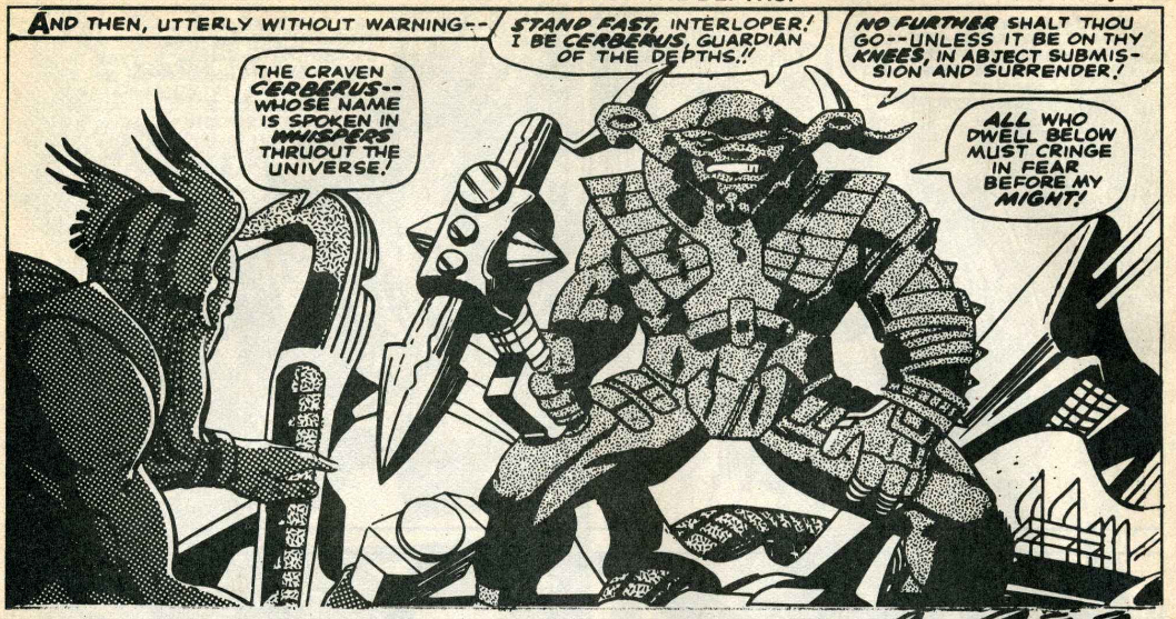
To some the Thor strip might have felt like a Hercules strip over the last number of weeks, but make no doubt that Thor is the star of this adventure. He's front and centre now he's been transported to Olympus where he confronts Pluto who taunts him that his cause is hopeless and transports the Thunder God on the rest of the way to Hades, where he must first battle the legendary guardian of the gates to hell, Cerberus.
I love the way Kirby takes the greek legend of Cerberus, a three headed dog that guarded the entrance to Hades and changed it into a giant with a horned helmet that shot "Rays of destruction." Did Kirby just create the guardsman and Stan Lee add the name Cerberus or did Jack intend the character to be Cerberus all along? Either way the pair know how to do fantastic mythological action in a Marvel manner.
As an interlude Stan and Jack turns the readers attention back to Earth and Thor's sweetheart Jane Foster. Who is pining for the Thunder God while in the company of her new mysterious roommate Tana Nile. Tana lets slip there is more to her than meets the eye as she forces her domineering will on the submissive Jane. Stan and Jack love building up future plots.
Meanwhile back in hell Pluto's minions are ready to crown a struggling Hercules the next ruler of the Netherworld just before the booming voice of the Thunder God halts the ceremony. Hercules unable to help due to an enchantment that was part of the pact he signed, must watch as Thor battle for the Prince of Power's freedom. Swords, hammers and axes are raised as Thor must face Pluto's hordes of Hades in a supreme test, whose conclusion will have to wait till next week as "all hell breaks loose".
A double dynamite of action as the readers are offered
a pair of winners from mighty Marvel. Sometimes the simplest of ideas work best and you can't beat just showing the two covers from the delights on offer. Notice how the Mighty World of Marvel cover still sports the six pence price tag while the actual comic had a strange font version of the 7p tag. Was this a proof copy or did they consider not changing the price on MWOM? While I write about the price tag it worth noting that all three comics had a different 7p font. Check next week to see if they stick to one version.
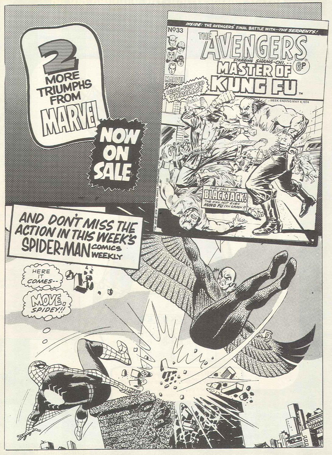
Avengers Weekly #33
If I told you that Ron Wilson drew this cover you're probably thinking it was for the UK version only, but this cover debuted on Master of Kung Fu issue 17, hitting the US newsstands on the 15th January 1974. It must have been a collective effort as MarvelFandom.com also lists Ernie Chan, John Romita Sr and Jim Starlin as artists who also worked on it, may be adjusting the pencil work or adding the inks and colours. I like the collective input even if the outdoor scene doesn't quite match up with the actual story, it's still a belter. It's my Cover of the Week and I'll fight you if you say different. No I won't really, always a lover never a fighter.
Master of Kung Fu “They call him ...BlackJack!”
Writer: Steve Englehart
Artist: Jim Starlin
Inker: Al Milgrom
Originally published in Master of Kung Fu #17
Cover date April 1974
(Published in January 1974)
The opening splash page uses the last two pages from last weeks ending in a vastly superior result than the attempt I made last week. A good use of the art, only spoiled by the poor choice of font for the title seen above it. 70's comedy writing does not give "They call him...Blackjack!" the dramatic feel it deserves.

I love all the iron-fisted action and it can be easy to over-look the intelligent plot and dialogue used in Master of Kung Fu, to which Steve Englehart is creator of. His name should hold more respect as a comic writer. He follows after Stan Lee with a long list of new writers who joined Marvel in the late 60's and early 70's who masterminded the world of comics for decades to come. Englehart joined a hotbed of talent with the likes of Roy Thomas, Marv Wolfman, Len Wein, Gerry Conway, Doug Moench, Chris Claremont and Steve Gerber. All producing the stories I loved as I grew up in the 70's, the same way that kids looked up to Stan Lee, Steve Ditko and Jack Kirby the decade before.

I particularly like the dialogue exchanged between Shang-Chi and Sir Dennis about mental strength. Sir Dennis starts by showing the son of Fu Manchu what his father had done to his legs adding in a fit of rage "I am a cripple!" To which Shang-Chi calmly replies "Yes, if you speak of your mental state!, Before I felt physical strength bursting from Black Jack Tarr. Now, from you I feel mental strength! Your strength is like a raging river--boundless--sweeping all obstacles before it--until the obstacle is yourself--and then your strength is dammed, forming a stagnant bitter pool of hate!" He then starts to raise his voice, "Forget that hate! Forget your legs! Forget yourself! Let your strength be all! Let your strength wash over you! Let it cleanse you--lift you--carry you!" Then he becomes calm once more with one simple command, "Stand!" It might be a little new-age-ish but the thing I really love about the Master of Kung Fu strip is that the artwork can be as strong as words and the words can be as strong as pictures, together they make a really powerful comic.
Marvel Bullpen Bulletins
The Avengers Bullpen Bulletins page is much the same as
the ones featured in MWOM and SMCW, with only the Marvel Checklist adjusted accordingly and a Special item to the Avengers. It relates to the previous occupations of Marvel creators like Master of Kung Fu artist, Jim Starlin who was an aerial photographer, MOKF writer Steve Englehart who started out as an artist, which might account why his scripts have an artistic flow. MOKF letterer Tom Orzechowski used to work in a hospital as an orderly before taking up the pains-taking task of lettering a comic. Roy Thomas was a school teacher and Tony Isabella was a newspaper man. There's some symmetry to all their original and new jobs. Starlin and Englehart went from visual jobs to creating stories through pictures, Roy and Tony carried their factual literate careers to literally become writers of fiction. As for Tom his patience with patients helped him learn lenience with letters. Puns are intended.
The Avengers “A people divided!”
Writer: Stan Lee
Artist: Don Heck and Jack Kirby
Inker: Don Heck
Originally published in The Avengers #33
Cover date October 1966
(Published in August 1966)
This splash page uses the cover from the Avengers #33 and you can see why not having it as the cover of this or last week's Avengers weekly was no loss. It showed the Scarlet Witch even though she doesn't appear in this story. Both Quicksilver and herself are on a leave of absence attempting to replenish their waning powers in their homeland. Don Heck was both cover and story artist so he would have known that. Her inclusion in the cover was probably supposed to have depicted the Black Widow instead but that would spoil part of the plot.
Sorry to prematurely spoiler plot but the Black Widow is aiding the Avengers in the rescue of Captain America, just as a fake Captain America argues that the Sons of the Serpent are right and the Avengers are wrong. I consider this the issue in which the Black Widow joins the Avengers. Technically, she doesn't, she accepted the official offer of membership in the Avengers #111 (US edition), cover dated May 1973, published February 1973, which British Marvel fans can read in Super Spider-man and the Titans #217 cover dated 6th April 1977. You could be forgiven for not seeing the Widow in this story, she spends a lot of her time in the shadows, which was the intension as she sneaked around the Serpent's ship, or taking a back seat to the Avengers. I do like her as an Avenger, so luckily she will take a bigger part in upcoming stories that do cover her seemly sudden change from villain to hero even though the reasons have already been explained in Avengers weekly #27.
Captain America is freed, the Sons of the Serpent are defeated and the Supreme Serpent is revealed to be General Chen all along! He says in a Scooby Doo kind of way "Everything would have worked perfectly if not for you accursed Avengers!" Comic cuts aside this storey does lay down some moral truths. General Chen's plan was to divide a country by creating distrust in preparation for conquest. A fearful nation becomes a divided nation. I'll leave the last words to Goliath who says "Beware the man who sets you against your neighbour!" and Captain America who adds "For, whenever the deadly poison of bigotry touches us, the flame of freedom will burn a little dimmer!"
Avengers Readers Assemble
Martin Lenihan from London would rather see the Silver Surfer in his own strip than Daredevil. He does add that he would be OK with DD (and the Silver Surfer,) in the Avengers line-up. Martin White KOF, from Wiltshire is asking for the Sinister Six to take on the Avengers. Well it would be some kind of battle, although I'm not sure it would be top of my list. Finally for this week N Deenter RFO, TBB, KOF, from Yorkshire who points out that Captain America's skill, strength and stamina are not obtainable to normal human beings because he gained all that via an injection of super-soldier serum. They also take a swipe at pronunciations and oriental dialogue in comics which is probably a fair comment.

Remember the six pence price tag on the cover of the Mighty World of Marvel as seen in the Double Dynamite in-house advert featured in Spider-man Comics Weekly? Well in the Avengers weekly version of that advert MWOM sports a seven pence price tag. Did the proof for this issue go off to press later than the SMCW one? I think that SMCW's cover artwork looks better in black and white than it does on the actual colour cover.
Doctor Strange “Where man hath never trod!”
Writer: Roy Thomas
Artist: Steve Ditko
Inker: Steve Ditko
Originally published in Strange Tales #146
Cover date July 1966
(Published in April 1966)
This story should have been printed before last week's tale of sorcery "To Catch a Magician!" that featured Mister Rasputin, but for some unknown reason it was swapped. May be the UK editors felt that the Rasputin story made a nicer stop gap between the Doctor Strange/Baron Mordo/the Dread Dormammu storyline that had been running and the Strange/Dormammu/Clea storyline that this tale starts. I think they could have been right. Strange is called to another dimension with news of the missing girl who helped him defeat Dormammu. He has to journey to the edge of infinity to a realm ruled by a shape-shifting sorcerer called Tazza. The clues that lead to the girls location had all been a trap set by Dormammu to defeat Strange. Both sorcerers test the limits of each others powers but Doctor Strange emerges victorious, freeing Tazza's previously defeated enemies and instructing him to never be inhospitable to visiting strangers again. Of historical note this story has the name of Satannish the Supreme invoked by Tazza, a name created by Roy Thomas and one he would use in thirty-one Doctor Strange stories time as a Doctor Strange antagonist.
It might have cost you seven pence for one of these fantastic comics or twenty-one pence for all three but for a triple treat of triumphs that still serves up a nostalgic hit fifty years later it was priceless!
See you in seven.
Make Mine Marvel.