Week Ending 13th April 1974
While doing these blogs I look out for any interesting facts on how these weekly mags developed, picking out big changes, but sometimes I miss the little things that don't seem important or simply because I overlooked that detail. The Mighty World of Marvel is British Marvel's longest running weekly at this point and I missed a change in it that was stirring at me right in the face. Thankfully Christopher Nevell, a member of the Facebook Group- UK Marvel in the Seventies, spotted something that I had over looked. The subtle but important change to the MWOM logo. So I guess I'd better give a quick review of those changes. Just from a point of time and space I'm not going to discuss colour changes, that more or less happen weekly, or those slight size changes. Instead I'll concentrate on just the four major changes from issue 1 to issue 78.
The original and the classic version, the Mighty World of Marvel #1 from the week ending the 7th of October 1972. Although the colours would change weekly this red and blue colour scheme was always the best colour variation, with the 3D Marvel font this was imposing and in my opinion has never been bettered.
The next change wasn't so much the wording or a change in font style but a change in size. It came with issue 48 on the week ending 1st September 1973 when the Hulk's name got bigger and bigger, taking twice as much space than "the Mighty World of Marvel starring the incredible" part of the logo.
The Mighty World of Marvel #80
No I've got a problem with this week's Cover of the Week award, I can't choose between two covers, simply because I really love them both. This week's MWOM cover uses the original artwork from the Incredible Hulk #123 by Herb Trimpe. The Leader is using the most bat-assed crazy weapon of all time, the Murder Module, against the Hulk. What I like about it you know that a tripod machine with a force beam gun is never going to be enough to beat the Hulk. But it looks great. The UK version has had its background colour changed from blue to red and the Leader gets a speech-bubble which all in all make for a more compelling cover. (Joint) Cover of the Week!
The Incredible Hulk "No more the monster!"
Artist: Herb Trimpe
Inker: Herb Trimpe
Originally published in The Incredible Hulk #123
Cover date January 1970
(Published in October 1969)
Apart from Master of Kung Fu and one Hulk story in MWOM #42 ("Heaven is a very small place!" an absolute classic,) all of British Marvel story content has been taken from the 60's. With a cover date of January 1970, (yeah I appreciate that the original comic was published to months earlier,) the story content is stepping into the 70's with bold strides, driven by Herb Trimpe's stylish artwork and Roy Thomas's direction.
The cure works with incredible results. Banner can change into the Hulk at will, with his mind in full control of the Hulk's muscular body. For the first time Bruce is at peace with himself, returning to New Mexico to pursue his old life and a renewed romance with Betty Ross. That joy grows with a lifetime of missed days that could have been filled with happiness crammed into a short time. Finally content, Bruce proposes to Betty and she agrees to be his wife.
I rave about Herb Trimpe's page craft when he uses multiple panels per page, but he's also a master of the splash page too. Take a look at this full page imaginary scene of Bruce Banner contemplating the nightmare scenario where he might revert back to his savage bestial personality. This wouldn't be a Marvel tale if our hero was going to have a wonderful time. There's always some fiend on the horizon to darken events. I sometimes moan about returning villains that feature week in, week out, like Baron Mordo in Doctor Strange and Doctor Doom in the Fantastic Four adventures, The Leader can seem like one of those arch-villains that can become very tiresome. May be not in this case as I feel he fits into the plot really well and we haven't seen him for nearly two months, which was ten weekly comics that make up five complete stories, so I guess it's fine. General Ross asks Banner and by association the Hulk, to escort the US military's latest weapon to its new home at the New Mexico base. The Tripodal Observation Module or Tom for short which sounds way too friendly so Roy Thomas refers to it as the "Murder Module" which is the prize that the Leader is after. An intelligent Hulk is no match for the Leader even with the stolen Murder Module, but in averting the theft Banner's control over the Hulk gives way slightly to his savage ego. A development that will seed repercussions next week.
Marvel Bullpen Bulletins
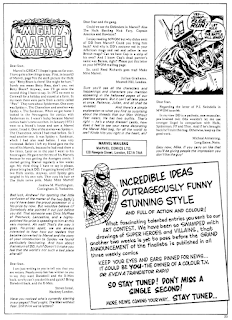
The nutty news and notes from one madman to another. Any kind of news for British readers has either been given a teaser advert or a column space in one of the weekly's letter pages in the form of "Stan Lee Sounds Off!" or "From the Bullpen to you" features, but new we are treated to a full Bullpen Bulletins page. The first edition promises that it will in each of the three weeklies will be filled with unexpected announcements and surprising features, but in truth I imagine that there won't be enough news to fill a page every week in every mag but I like the feature. The centre part of the page is given to "Stan's Soapbox", a cut and pasted column that American readers would have probably read in the US mags. The artwork under the column is adapted from a Steve Ditko panel taken from a fun story called "How Stan Lee and Steve Ditko Create Spider-Man!" More on that later in this very blog. The art bodger has given Stan a cheeky smile with a new moustache and cigar. Other news in this bulletin is the coming of Shang-Chi to the Avengers weekly, something that Avengers fans would have already known about to many's disproval. There's also a "Mighty Marvel Checklist" which is a run down on all the weekly mags on sale at the time of printing. Special to the Mighty World of Marvel was a quick summary of the creators of the mags stars. This brought up a rather interesting fact that the name Daredevil once belonged to another super-hero in 1951. The truth is that in 1940, not 1951, artist and writer Jack Binder created that character as a back-up strip in the pages of Lev Gleason Publications' Silver Streak Comics #6 in September 1940. Daredevil was a boomerang whelding marksman who became a vigilante after witnessing the murder of his father. Binder is also known for co-creating the Timely Comics character the Destroyer with Stan Lee.
The Mighty Marvel Mailbag
Andrew M. Worthington from Yorkshire read a Pow! comic while on holiday in 1972 which featured a Spider-man vs the Chameleon story, in 1973 he went round to his friends house and read the very same story in a MWOM comic. That friend then gave him a large collection of MWOM as he had read them all many times. Later in the year upon another visit his friend gave him the rest of them as he had then chosen to get the Avengers instead. Since then Andrew regularly gets MWOM every week. Steven Isreal from London writes that Marvel are "rotters" as nearly everybody requested Daredevil and the X-Men but they are never given their own strip in the weeklies. Well DD is back, give the X-men a little more time. Julian Grahame from London wants to see the Defenders and an unusual battle of the Hulk against Nick Fury, Captain America and Hawkeye. Micheal Armstrong from Nottinghamshire certainly isn't a Daredevil fan, replying to P.J. Swindells letter in MWOM #66 he calls DD a pathetic, non-muscular pea-brained twit. It's a good thing that his mother wouldn't stand for stronger lingo 'cause I fear Micheal would be getting quite a backlash from Daredevil fans. This page also has a teaser that in two weeks the results of the design a super-hero/villain competition will be revealed. Now that kind of news could have been used in the Bullpen Bulletins page.Daredevil "A time to unmask!"
Writer: Stan Lee
Artist: Bob Powell
Inker: Wally Wood
Originally published in Daredevil #11
Cover date November 1965
(Published in September 1965)
The opening splash page to the second part of this adventure uses the original artwork from the cover of Daredevil #11, which in it's self looks like it was originally taken from the first panel of the fifth page of this weeks story. That to my mind seems very rare but it would saves some labour and time. This week's story title uses the original story title but not written in the same style as it originally featured in the US edition. Daredevil defeats the Organizer's gang and also reveals the Organizer's real identity. All the clues were there, did you spot it? Abner Jonas was the mastermind behind the Organization. DD states that the killer clue was that Jonas had neglected to remove his ring when he appeared as the Organizer, which is strange as he most appeared on screen and so how would DD's senses work to notice a ring on his hand? The only other time Daredevil meet the Organizer in the flesh was when he was disguised as the Frog Man and at no point could DD have felt the ring! The obvious answer is DD detected the that they where the same person by smell and he was bluffing. In a thought bubble he says his radar sense detected it but that seems a stretch. At the end of the tale Matt Murdock says he's leaving for a while to travel that isn't meet with any positivity from Foggy or Karen. So we are left with a new story line and the promise of a new artist for next week.
Spider-man Comics Weekly #61
As I said earlier I'm going to have a joint Cover Of the Week winner this week cause I love both MWOM and SMCW's covers equally. If you have a favourite from the two let me know. This cover uses artwork by John Romita Sr from the cover of Marvel Tales volume 2 issue 44, cover dated August 1973, published May 1973. That comic reprinted the original story from the Amazing Spider-man #61. In truth the Amazing Spider-man cover wasn't that good so I'm glad this one was used instead. The image of Spider-man from this cover will get used again and again.
Spider-man "Death is the Kingpin!"
Artist: John Romita Sr and Don Heck
Inker: Mike Esposito
Originally published in the Amazing Spider-man #61
Cover date June 1968
(Published in March 1968)
This "Brainwasher" affair wasn't a storyline that I was originally excited about, but I have to admit that as it reaches its conclusion I'm really into it now, the stakes are hotting up. The Kingpin has sent his men to silence Captain Stacy and Peter Parker after he had taken a picture of the Captain helping the Kingpin's men rob the Police Headquarters. Their third target is Spider-man himself.
Iron Man "The icy fingers of Jack Frost!"
Writer: Stan Lee and Robert Bernstein
Artist: Don Heck
Inker: Don Heck
Originally published in Tales of Suspense #45
Cover date September 1963
(Published in June 1963)
This opening splash page is the actual first page from the original US version, even though this is the second part of that story, following on from last week's first part. Professor Shapanka is caught redhanded while robbing Tony Starks vault. Stark lets the Professor go, pressing no criminal charges but he does terminate the Professor's employment. Shapanka swears he'll have his revenge on Stark and Iron Man when he later designs and builds a suit that gives him frost powers. After robbing a bank the newspapers christen him Jack Frost. It's a typical 60's comic book story, When he encounters Iron Man the golden Avenger uses a "miniature furnace" to defeat the icy fiend. Corny is the word best used to describe this strip.
Marvel Bullpen Bulletins
The Mighty Thor "Pluto victorious!"
Writer: Stan Lee
Artist: Jack Kirby
Inker: Vince Colletta
Originally published in The Mighty Thor #128
Cover date May 1966
(Published in March 1966)
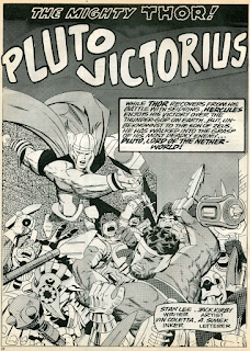
Good use is made of the cover artwork from the Mighty Thor #128 showing Hercules battling Pluto's demons and Thor rushing to his aid, as the opening splash page of the second half of this story. Although like many such times when a cover is used in this way, it does jar slightly with story continuity, as the very next page shows events that happened prior to that where Hercules watching a staged fight between the "Amazon Queen" and a film extra.
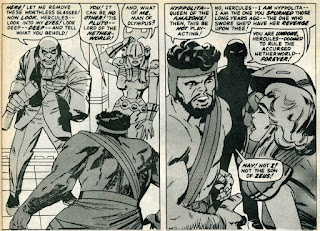
Once the contract is signed Pluto removes his glasses to reveal that he is Pluto the once ruler of the Netherworld, while the "Amazon Queen" removes her helmet to also reveal that she is really Hyppolita the real Queen of the Amazons who Hercules spurned millenniums ago. So Hercules doesn't recognise his Uncle and his Niece. Far fetched you might say, but Hercules does drink a lot and how do you think those Greek myths started. So why let logic get in the way of a great romp. The tricked Greek God has to fight Plutos minions and Thor arrives to challenge Hercules to regain his injured honour now that his full strength has returned, but helps him instead after he sees the Olympian battling increasing odds. A battle of Gods, I just love it.
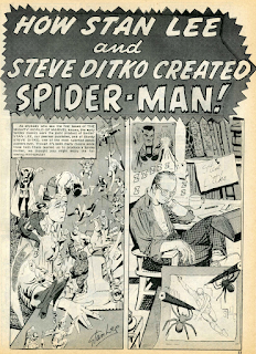
"How Stan Lee and Steve Ditko created Spider-man!"
Writer: Stan Lee
Artist: Steve Ditko
Inker: Steve Ditko
Originally published in The Amazing Spider-man Annual #1
Cover date October 1964
(Published in June 1964)
This story was first published as a comedy extra in the Amazing Spider-man Annual issue 1, but the first time I read this story was back in the winter of 1979 when it was published in the Spider-man Winter Special. The first thing I noticed when I read this version in Spider-man Comics Weekly was that a "D" had been added to the word "create" in the title. I assume that this was so that it wouldn't create any confusion with the current creators of the Spider-man strip running in SMCW.
The Avengers #30
After two weeks of Shang-Chi on the cover you would imagine that the Avengers would get to star on their own cover, but no, this very poor cover is used as the Master of Kung Fu's third cover, adding more fuel to the bonfire from those fans who didn't like the the strip. It's not even the artwork from the original comics cover, that will be used next week. Ron Wilson and Mike Esposito are responsible, so don't blame me.
Master of Kung Fu "Midnight brings dark death!"
With Master of Kung Fu's second story there came a chance that all the good stuff had been used in the origin story and the quality might drop. I quickly looked through this mags artwork and did feel that there was a dip, possibly because of the heavy tones used throughout this weekly, but when I actually sat down and read the story I quickly changed my mind to the fact that the artwork and story maintained a high level of quality.One thing that did shock when I re-read this story for this review was just how much racist dialogue was used. The term "slant-eyes" and "slant" against Shang-Chi by the Central Park muggers does leave a bitter taste in 2024, but in the 80's, when I first read this story it had only a minor effect, in so much that I thought these men weren't nice. I suspect that Englehart intended that to have been the desired effect. A writer nowadays would try to steer clear from any controversy. Which is a shame because I think that it can be used to drive a story and a conversation towards a positive outcome. The muggers do get a "good kicking" for their xenophobic attitude but only after they attack Shang-Chi. The fight scene is beautifully choreographed in these twelve panels, something that Steve Ditko would have shied away from if his comment in the previous story from this blog is anything to go by. Minimal use of dialogue, maximum action. Smashing!
The real antagonist for this story is M'Nai, more commonly known as Midnight. A character that first came to my attention in Super Spider-man #267, cover dated 22rd March 1978 in the Avengers story "A Quiet Half-Hour in Saigon!" and the issues that followed, as Kang pulled characters from the past to fight for him in his Legion of the Unliving. Again that story was written by Steve Englehart and I loved it. Marvel Bullpen Bulletins
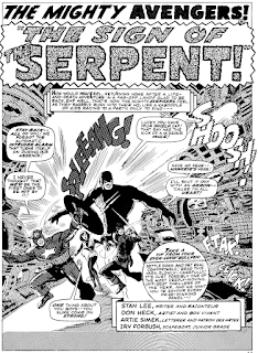
The Avengers "The sign of the Serpent!"
Writer: Stan Lee
Artist: Don Heck
Inker: Frank Giacoia
Originally published in The Avengers #32
Cover date September 1966
(Published in July 1966)
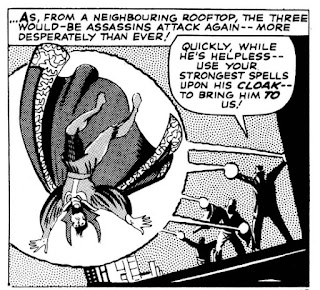
Some fans may have stopped buying the Avengers weekly as a protest against Master of Kung Fu's take over, which would have been a real shame as the assemblers are in a great period, with Stan Lee and Don Heck producing their best Avengers work ever. Yeah the Thomas/Buscema run that follows will be even better but don't let that but you off the goodies that are being showcased here. "The sign of the Serpent!" marks the debut of the Sons of the Serpent, a group of xenophobic hate mongers who are basically the Ku Klux Klan but in green and yellow robes.
After Bill Foster's attack Henry Pym promises the Avengers will assemble in response to the brutal assaults, adding that even his experiments, that have reached a critical stage, can wait while the Sons of the Serpent are dealt with. Goliath calls a meeting with the other Avengers, showing them the Serpents calling card of a snake like staff. The Wasp questions, shouldn't the Police deal with the Serpent "bully boys"? But Captain America points out that there is far more to this than a few isolated hoodlum attacks, adding that they appear to be well organised, well funded and operate on a national level. We'll see more from the serpents next week.
Avengers Unite!
Kevin Wright wants no wise-cranks to his questions, when will the X-Men be back, why does Namor, the Sub-Mariner live under water and when will Marvel bring out a comic with Conan and the Silver Surfer in it? The X-Men will guest-star in a strip soon, the Avengers in fact. The Sub-Mariner lives under water because that's were he comes from and the problem with producing more British comics is money. But you never know both could appear pretty soon. David Vance from County Armagh doesn't want the fact that the production of the UK Avengers weekly might stop the import of the US Avengers comics. And finally for this week Gary Audas from Bedfordshire never imagined that after first buying the Mighty World of Marvel more comics like SMCW and the Avengers weekly would follow and become big hits on the newsstands.Doctor Strange "Those who would destroy me!"
Writer: Stan LeeArtist: Steve Ditko
Inker: Steve Ditko
Originally published in Strange Tales #142
Cover date March 1966
(Published in December1965)
After we are treated to a demonstration of how Stan Lee and Steve Ditko create comics and I praise Stan's writing in this week's Avengers strip, Stan go and telephones in a script for the Doctor Strange strip with the most clumsiest recap ever used in a comic. Some of that clumsy dialogue is given to Doctor Strange too as he explains that there is no trace of Baron Mordo at his Greenwich Village Sanctum Sanctorum, but there should still be, yet all that remains is the aura of the sorcerer known as the Demon. But shouldn't the Demon when removing all traces of the three Mordo disciples would have included him his own aura?
Alerting him to the possibility that there has been an intrusion Strange uses the Eye of Agamotto to locate a hidden bomb. Smashing through a window Strange throws the device out of its explosive range only to be captured by Mordo's three disciples. Two of them we have meet before when Strange was alluding capture from Mordo, the third is a mysterious character in a dark suit, hat and a black featureless mask. This person seems to be the Baron's second in command. Later a female sorcerer is introduced as Mordo's loyal deputy at no point did the dark masked person look like a female. Was this a mistake that fell between Ditko's in tension shown in his artwork of the later added Lee script? Who knows why, but it does feel strange.
The sorceress, who isn't named in this or the next story, but would in the future be named Adria, (What's with Lee and Ditko not naming the female characters in these Doctor Strange stories? What with this sorceress and Clea you'd think that there was something more to it.) alerts the Demon's men that Strange is escaping. Which the Doctor does by briefly assuming his spirit form, then returning to his physical body to get around. That technique can only get him so far. So next week the Doctor will face even more troubles. The artwork is great and creative but the messy plot-holes in the script spoil what should be a good story.
The final in-house advert of the three weeklies ends with a cover shot of this week's the Mighty World of Marvel and a Spider-man Comics Weekly logo above a panel of Spider-man swinging in through a window to kick a group of the Kingpin's men. Which is fine, except that the very same SMCW advert was used last week, but it had "#60" next to the Spider-man logo, while this week's version has "#61". Don't believe me? Check it out for your self here. The last thing for this week's mag is an advert for the "Fistful of posters" for 90 pence that was shown on every back page of last week's and this week's mags. Well because the artwork by Rafael Lopez Espi is absolutely stunning I'll show it again. Enjoy!
See you in seven.
Make Mine Marvel.











The dialogue wasn't the only uncomfortable racist aspect in Shang Chi. At least they were printed in black and white in the UK, whereas the US originals used an awful shade of orange/yellow for the Asian characters , a practice which seems to have continued onto the UK colour covers! It took a long time for such stereotyping to be deemed unacceptable....
ReplyDeleteIt wasn't just the Asian characters in the colour edition. Characters like Bill Foster and Gabe Jones from the Howling Commandos would be coloured in a strange purple colour, that would change slightly even from panel to panel. Partly because the colour grading wasn't good enough at the time. I don't think the heavy tones in the Avengers weekly was much better for fairly portrayed people of colour.
ReplyDelete