Week Ending 1st September 1973

Before I dive head long into this weeks magnificent Marvel mags i'd like to mention a bit of trivia brought to my attention by Chris Tolworthy via the wonderful Facebook group, the Mighty World of British Comics. The image of Sue Storm posing in Reed's "Nuclear Measuring Device" headgear drawn by Jack Kirby on the opening splash page of the FF story was inspired by a painting drawn by the artist Vargas.

The original artwork was published in Playboy Magazine in 1963, while Kirby's version was published late 1963. You can see more on it in the Warlocks home brew blogspot for more details. Chris writes in his comment for those who didn't see the original Facebook post, "If you want to get VERY nerdy, note how Kirby improves on the original. I don't mean by adding clothes, I mean pay careful attention to the feet: the original would fall over forwards. This might be what inspired Kirby to add the heavy headgear. With the added weight, and slight extention of the left foot, Kirby's version is balanced." I've personally had a soft spot for Sue Storm and I've always thought that this image was very glamorous and now I know why. Even the greatest stole ideas from time to time. Like they always say if you're going to steal, steal from the best. Thanks Chris, nice bit of trivia spotting.
The Mighty World of Marvel #48

This weeks cover for MWOM is a cut and paste up job by three pencilers and three inkers taken from three US comics, so hold on tight as I list the who and where from, there may be questions later. The Hulk and Thor are taken from a splash page in The Defenders #10 cover dated November 1973 (published August 1973, US,) by Sal Buscema with inks by Frank Bolle. The Sub-Mariner figure is taken from the cover of Marvel Feature #1cover dated December 1971 (published July 1971, US,) drawn and inked by Neal Adams. The final two characters on this cover, the Wasp and Iron Man are taken from the cover of Captain America #100 cover dated April 1968 (published January 1968, US,) by Jack Kirby with inks by Sid Shores. Don't believe me? Well here's the proof.


Yeah it's a mash up but I really do like this weeks MWOM cover, there's some of my favourite artists on one cover, it shouldn't work but it does. As ever I couldn't do this blog without the incredible reference websites that are a god send for information and are fantastic for saving me time. Thanks to Grand Comic Database, marvel.fandom.com and Specsavers (for the glasses which save my eyesight after the amount of time I spend browsing pages after pages of internet and comics.)
The Avengers "The Avengers meet...the Sub-Mariner!"

Writer: Stan Lee
Artist: Jack Kirby
Inker: Paul Reinman
Originally published in The Avengers #3
Cover date January 1964
(Published in November 1963)
There are three stories in this weeks duo of Marvel UK comics that are drawn by Jack Kirby and each one has a different inker embellishing the King's artwork. They're a good example of how a the inker can enhance the artwork or cheapen it. Kirby's artwork can split opinions, some call it too simplistic, too unrealistic, too complicated, too pedestrian, which all seems to be contradictory to me. Yes his early Marvel work was plain, that was the style required to tell those stories. Later his stories grew more complicated as the readership grew more sophisticated in their reading. Kirby's best years were from September 1965 to 1970, which happened to be when he was inked by Joe Sinnott. In the early 70's newer artists became the trend with the likes of John Buscema, Neal Adams, Jim Starlin, Paul Gulcuy, and later 70's artists like John Byrne and George Perez. Many of those followed his style and added to it. What ever you think of Jack there can be no doubt that he was an unbelievable creator, whose ideas and concepts shaped the Marvel Universe for decades to come.

A quick note or two on this story, Iron Man is seen in his MK III suit for the first time in Marvel UK. Its kind of strange that the Wasp even at full height still has wings, they could be just for show as soon they were forgotten about. Roger Stern and John Bucsema brought them back in Avengers in 1985.


Spider-man and the Fantastic Four weren't the only heroes that Iron Man called on to find the Hulk's location, in the original US edition after Spidey he visited the home of the X-Men. The young mutants would soon make their debut in MWOM but even though their appearance would make an interesting teaser I understand why they were edited out. Here's where I contradict my opinions, I may not like their work on this Avengers story but Kirby with Paul Reinman's inks really work well with the X-Men as you can see from this page the X-Men look great, as an art team they would work on X-Men #1 to #5 and I'll rave about those stories very soon. As you can see in the colour version I'm not sure Kirby liked Spider-man.
 Let's not level all the criticism at Kirby, Stan Lee reused the same characters to death in these early strips. It seemed like Loki, Hulk, Doctor Doom and the Sub-Mariner would appear everywhere. Maybe he knew what the kids wanted and he give it to them. The freshly quitted Hulk became the plot driver and Namor the antagonist. OK I'll admit it, I did really want to see the big men duke it out with one another.
 The modest plot centred on the Avengers looking for the Hulk, the Sub-Mariner teaming up with the Hulk, after having a small fight, then Namor calling the Avengers over to Gibraltar to have a bigger fight in which nobody wins and no-one loses. Why Gibraltar? It's an island surrounded by sea that give's Namor an advantage. It's no Ben-Hur but like I said before I kind of like seeing these titans clash. It is what it is, but it isn't the best version it could be. We'll look at that version later.


 There's lots of invisible force field action this week and we get to see, or not see, how it would look like. A style that would last for decades. The Invisible Girl now has a power that lifts her up to be an important asset to the group. She stops the Mole Man from pressing a switch that will lower whole cities that he hopes will set the surface world off against each other. The FF do out wit the Mole Man, destroying his lift technology and escape his underground kingdom. But I can't help but question are the targeted cities still held up by his hydraulic platforms? If so I hope that the hydraulic fluid doesn't leak other wise we might get a sinking feeling.


 Raxton uses a disguise but after some cold punches to the kisser Spidey comes to the conclusion that the only one to pack an iron like punch was the Molton Man. He places a Spider-tracer on Raxton and follows him to the same jewellery store and forces him to shred his disguise, the Molten Man escapes but Spidey beats him back to his apartment to await the villains return. Spidey uses the same trick from last time they fought, hog tying the fiend. The police arrive so Spider-man goes off to recover his camera with picture proof that Raxton had broken the law and this time would serve a longer sentence in prison.

 Writer: Stan Lee

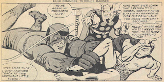
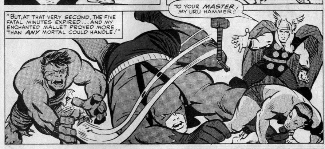
 Thor believing that of all who walk the Earth only the strength of the Hulk seems to match his own, but to prove which of them is truly the strongest in a fair fight the Thunder God requests that Odin grant him five minutes during which he may retain all his power with out his hammer's magical energy as a test of his strength against his foe. Agreeing to the petition for five minutes Thor's hammer loses all its magical force. During the battle the Hulk stops the full force of Thor's mighty mallet, even holding it in his hand, something no mortal has done and he himself couldn't do if the hammer had retained its magical enchantment.


It's Wordophobia results time

No letter pages in either MWOM or SMCW this week but we do get a double page feature on the winners of the Wordophobia competition from Week ending 7th July 1973 comics. You had to make as many words from the phrase "Children's film foundation." I'll not list all the winners, there's far too many but the 1st prize winners did incredibly well, for the boys Andrew Chisholm from Carlisle (over 5500 words), G J Verdon from London (over 5000 words) and Michael Cavanagh from Beckenham (over 4500 words). The ladies 1st prize winners are A Verdon from London (with over 5000 words), Maureen Hall from London (over 3000 words) and Amanda Nieves from Thorpe Bay (over 2500 words). Was G J Verdon and A Verdon related? Both had over 5000 words, did they copy? Who can tell? As part of the competition the entrants were asked to send in Green Shield Stamps for ABC Cinemas scheme to provide a Chairmobile (by that I think they mean a wheelchair,) for a disabled person, which is quite a worthy cause. The slightly creepy named Uncle Reg (Reg Halley, manager of minor promotions for ABC Cinemas,) wrote a letter thanking Marvel UK readers for their generosity in collecting an impressive 185,409 Green Shield Stamps. A total of 219,680 stamps was required for the chair, so close but not quite enough, hope they found other ways to raise the rest.

Also this week we get the answers to the first pocket money competition from MWOM #43 and SMCW #24, who's winner was Adam Bowes of London who won £1 each week for a whole year. He answered correctly that Washington DC is the capital of the USA, the Pacific is the world's largest ocean, the River Seven is the UK's longest river, heat changed the Thing back into Ben Grimm and also that Jane Foster is Doctor Blake's nurse.
If you thought that they were easy try out the third and final pocket money contest questions for another chance to win the impressive sum of £52 pocket money, impressive for a 1970's child's point of view. The first all correct entry opened on the 14th September bagged the weekly prize. You also had to collect a second coupon from next week's issue and answer a survey question- "My favourite Avengers character is...?"
1) Which of these cities is known as the "Granite City"?
a) Bath
b) Aberdeen
c) Exeter
2) The Menai strait is off the coast of?
a) Wales
b) Scotland
c) Ireland
3) The capital city of Northern Ireland is?
a) Londonderry
b) Belfast
c) Dublin
4) The youngest member of the Fantastic Four is?
a) Ben Grimm
b) Sue Storm
c) Johnny Storm
5) Spider-man is an expert?
a) Artist
b) Photographer
c) Musician
The Fantastic Four "Encounter under the Earth!"

Writer: Stan Lee
Artist: Jack Kirby
Inker: George Roussos
Originally published in The Fantastic Four #22
Cover date January 1964
(Published in October 1963)
The cover of the Fantastic Four #22 by Jack Kirby and George Roussos is recycled to form this weeks opening splash page with a new title. This is Kirby's second strip this week and his second inker. Out of the three inkers I think George Roussos is the second best of the three, but mainly because of last weeks first part of this story. It was close but I think the Invisible Girl pose swung it for me (see the start of this blog). There's detail in his inks but lots of his characters are "blocky", is he taking short cuts over Kirby's pencils?


This story's importance in comic book history is not only Susan Storm discovering her new invisible force field and invisibility of objects and other people powers. But also this story is the first one to feature the Thing uttering the immortal words...
"It's Clobberin' Time!"
Spider-man Comics Weekly #29

I really liked both this weeks covers, they're bright and colourful. MWOM #48 had some great artists working on it and this weeks SMCW also has artwork from some of Marveldoms greatest cover artists. The clear, smart lines come from Rich Buckler with inks by Frank Giacoia. The Grand Comic Database also says that John Romita SR may have added or altered some of the artwork. I can't disagree with that, but I can say I love it!
Spider-man "The Molten Man regrets...!"

Writer: Stan Lee
Artist: Steve Ditko
Inker: Steve Ditko
Originally published in the Amazing Spider-man #35
Cover date April 1966
(Published in January 1966)
As is becoming the norm Stan Lee is credited for script and editing and Steve Ditko is credited for plot and artwork. Art Simek is also credited for lettering and loitering. Mark Raxton is released from prison after a judge passes a verdict of a suspended sentence for the charges he received in SMCW #22 due to him being a first time offender as well as him being the victim of the unfortunate accident that gifted him his steel like skin. That's just the way the Marvel universe justice system works. Raxton lay low for a while but soon he's plotting a jewellery heist that brings him to the attention of Spider-man.


A page to fill so way not fill it with another villain focus from the Gallery of Spider-man's Most Famous Foes! This time it's the Crime-Master drawn by Steve Ditko, originally published in the Amazing Spider-man Annual #2 cover dated October 1965, published June 1965.
The Mighty Thor "The mighty Thor battles the Incredible Hulk!"

Artist: Jack Kirby
Inker: Chic Stone
Originally published in Journey into Mystery #112
Cover date January 1965
(Published in November 1964)
I'm currently reading an essay by comics legend Alan Moore (Alan Moore's Writing for comics, published by Avatar Press.) were he discusses a good starting point for writing a comic is the "idea", basically what the story is essentially about. While the plot is what the writer forms to get to the idea. The idea for this Thor strip is the age old question "who's stronger the Hulk or Thor?" It's quite a basic idea that to be fair gets used regularly with other characters. I'm not sure what Moore would think of it but Lee and Kirby get good mileage out of the concept. The plot revolves around an old battle between the Norse God and the green monster as seen in Avengers #3, the lead story from this weeks MWOM. This Thor story was published a year after the Avengers story, giving Stan and Jack a second go at it. I think this version of that idea is explored with greater creativity with this plot. I have to be honest I originally saw this story in Spider-man and Hulk Weekly #415 and #416 from 18th to 25th February 1981 as a Hulk story. I hadn't seen the Avengers story that this tale looks back in any form at that point, which gave me an unrealistic view of the Avengers story that didn't live up to the hype.

The plot is initialised by a group of children arguing between each other who would win in a fight between the mighty Thor or the incredible Hulk. Much like fans of football teams argue which player is best, or film fans discuss who the best action hero is. Thor lands to settle the disagreement in the fairest way he can by retelling an encounter with the Hulk.
This new version strips back all the unrealistic, illogical, far-fetched plot from the original tale of the Sub-Mariner teaming up with the Hulk to fight with the Avengers and concentrates on the idea of the battle itself. 

What follows is an evenly matched clash of titans, the kind of battle that kids of a certain age love to read. As a middle aged kid myself I got a big kick from reading this story. Kirby is given a second chance to do this story idea justice, helped in a massive way by the skilled use of inks from the brush and pen of Chic Stone. Who wins this weeks "who's the best Kirby inker" competition. Paul Reinman and George Roussos may be get the job done on time but they just don't cut it for me.
Just take a look at this panel that is similar to one used in the Avengers strip seen earlier in this blog. Chic Stone enhances Kirby's original pencil lines in a way that Paul Reinman doesn't.

Unlike the question "Who is the strongest?" that is asked in this tale, to which no conclusive proof can be found, the question of who inks Jack Kirby's artwork the best might be answered with the name Chic Stone. But like many questions there's always a better answer and mine to that is Joe Sinnott. Just wait till he starts inking the Fantastic Four! He makes Stan and Jack's legendary run on those characters iconic. They couldn't have reached those heights without Jolly Joe Sinnott.
But that's a tale for another time.
See you in seven.
Make Mine Marvel.
Totally agree about Kirby's pencilling needing a great inker. I always felt Joe Sinnott brought out the best in the artwork. (Even in the early days, he inked FF#5 and made it the best looking early issue!) George Tuska on Thor, on the other hand, simplified things to make it easier for himself, eliminating background characters with an eraser etc. so he didn't have to ink them. The magazine "The Jack Kirby Collector" has published numerous surviving pages of his pencils which, even on early 60s examples, are detailed and characteristic of him and show how the published, inked versions did him a disservice and effectively meant he had wasted time. But he still never did anything less than his best because he loved doing it so much!
ReplyDeleteR.I.P. The King
I agree with your point, but I'm not sure George Tuska inked any of Jack's Thor work. Could you be thinking of Vince Colletta? I have a love/hate opinion on Colletta's inking. Some of those Thor pages are beautiful and I adore the strip. But I've seen some of the originals too that show Colletta's short cuts and I despair the lose. Yeah he was efficient and always on time for the deadline but think what wonderful works of art those comics could have really been. Thanks for your input, it's always great to hear from you.
ReplyDeleteYou're right! Don't know why I put Tuska's name, other than having a low opinion of his work and writing it late at night! Senility creeping up, I suppose...
DeleteI think Vince Colleta was managed to bring a roughness to Thor that actually worked, wheras his work on many other artists was detrimental and I can u derstand the poor reputation he has. The only other exception was the Shang Chi run he had with Paul Gulacy which seemed much lighter.
ReplyDeleteHowever, my favourite inker of Kirby on Thor was actually Bill Everitt. He brought a smothness and to the art that was often missing in Kirby's work.